Saturday, November 1, 2008

4. Peranakan Museum Week 3

30th AugIn Week 3, we went to the Peranakan Museum. The museum tries to reflect the vibrancy of this group of mixed bloods. There was an emphasis on the strict rules the Peranakans set for themselves and their future generations. Elaborate practices and traditions to keep their culture on going and also to flaunt their wealth.
There are lots of influences that gave rise to 'Peranakan culture'. Mainly Chinese elements, but also Malay, European and Indonesian, if I may name a few to define them.

My storyboard


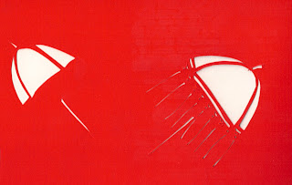
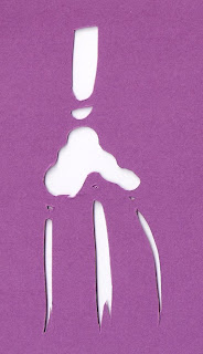
Paper cuttings I did at the Museum


I returned to the museum again and decided to pick the Door Gods as inspiration.
Because the voluntary tour guide made the point that the Door Gods had something to do with the Tang emperor and how the came to being murals on doors for all the houses of the common men.
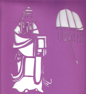
1st try
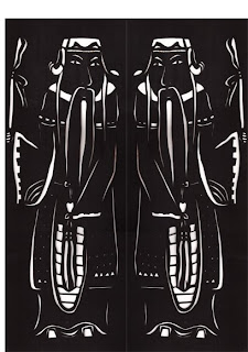
I tried again to cut the Door Gods, and consciously tried to modify it so it wouldn't look very Chinese. As I was doing it, I thought it looked a bit like the Kings of playing cards, and slightly medieval. I didn't think it was bad. I quite liked it but I needed some kind of assurance that this wasn't too Chinese looking.
The idea was to have this placed on the back of a dress, with a zip between the gods, so it protects the wearer from malicious men.
Tang said it looked too Chinese. I thought it was perhaps because I was putting Chinese influenced characters on paper through paper cutting which is a traditional art form in China, and I was worried that people who do not readily accept cultural things may not buy it, and "you will lose a 1/3 of the world who are Christians and Muslims" as Tang declared.
Emma said she wouldn't wear characters on the back of her dress. She pointed out that people don't usually wear characters on their clothes unless they are some kinda musician, idols that the wearer is into.

I did my research by going out to Holland Village on Saturday night (and also consciously everyday) and I was looking for any one who wore a character on their clothes. But few people do that. Those who did had some kinda cartoon on it. Sesame street, cute Japanese cartoons and the like. Other types of print like florals or stripes are definitely more readily accepted by the everday folks.

Perhaps that's just the way it is. I never really liked characters myself. I sometimes thought if I wore a huge silly cartoon characters, people would be looking at my shirt and not my face.
I think I shall ignore the fact most people don't wear characters and move on.

I thought of introducing some other culture's distinctive fashion into the door gods..
or giving the gods a cool Chris Martin face because Coldplay is a good and for sure and he has a pleasing face.


I was thinking a lot about clothes that have details on the back. I am certain that most designers/apparel makers and consumers like details on the front so that the wearer can see himself and feel good about the clothes he's in. Any piece of clothing that has focus on the back tends to be a detail that the wearer can physically feel. They include any kind of top or dress that bares the back's skin whether it be a spaghetti strap or a plunging low detail. This is my analysis for now. I might be wrong.

Thursday, October 30, 2008

5. Designer Research Week 4

30th Aug

This week, I presented Eley Kishimoto as the fashion designers that I find use textiles in an inspirational way, and tried to make a connection between its works and mine.


"Eley Kishimoto is the brand of designers Mark Eley and Wakako Kishimoto. Mark is from Wales and Wakako is from Japan. They are based in London, and have been showing at LFW since 2001. I have chosen three collections to describe their design output based on speculation.


AW 0405 collection
Imagery: Hunters, blood and innocent fawns.
Pattern: English florals, stripes, animal silhoettes. They range from tiny to oversized prints.
Placement: Experimenting the effect of semi circles on the side seams and at the waist. Exaggerated deer head. on bodice.
Texture: Knits, twee, heavy and semi-heavy fabrics.
Colour: Camouflage army colours. leading to crimson blood and primary reds and blues. Light pastels accented with black.
Silhoette: Simple shapes- trenchcoats, turtlenecks, knee-length dresses.


SS 06
Imagery: Astrology, stars and clouds. Pop art.
Pattern: Large phantasmagoric prints, and teeny regularly repeated prints.
Placement:Large print garments made from one single piece of design, while small repeated patterned garments have bits of solid colour accent.
Texture: No physical texture in most collections. Lightweight fabrics- cotton and polyester used in this collection. Green dress seems to have an embossed jacquard texture.
Colour: Primary and neon colours.
Silhoette: Fitted clothing, some structured pieces. A-line dresses, boxy jackets, high-waisted skirts.


SS 08
Imagery: Tropics? Hawaiian flowers, African zig-zag motif, grass, clouds and chains- sailor influences?
Pattern:Irregularly and diagonally-repeated prints. Some non-repetitive prints.
Placement: Garments entirely made of a single printed fabric.
Texture: Lightweight cotton, jersey.
Colour:Some colour ways, bright orange, yellow, parrot green, with hints of black and purple.
Silhoette: Loose-fit garments, straight-cut dresses, flared dresses with an underlayer of ruffles.


From these three EK collections, I think there is an obvious fusion of a bit of Japanese art with Western aesthetics. Some influences of Art deco involved, and they are definitely inspired by everything they come to contact with every day, nothing philosophical.
Their approach is eccentric and simple, there is an emphasis on the use of colour and shapes.
Some outfits have clashing fabrics on the details such as pockets or when layered.


I like EK's cartoon-like use of colour and imagery, as well as the kind of girlish clothes they create. The pictures above show use of trompe loeil which is humourous and use of colours and imagery which i really admire.


I dislike these grandma-like silhoettes. They are stiff coats in patterns and colours I wouldn't immediately recognise as EK's work.


The picture on the left is from an EK-Ellese collaboration. It's got lots of penguins on it, and I think there is probably a parallel between the imagery I have created- the selection fo an animal to work on and repeating it.


I recently tried paper-cutting. The solid shapes and colours are definitely similar to some of EK's work.


This EK dress is printed to look as if its got lots of ruffles. I am interested in creating 3D textures on 2D surfaces.

In all, my work has some parallels to EK's but it isn't clearly evident since I am stilll unsure of my direction. I am going to try and experiment with more textures and shapes as well as placement.

sources: style.com, eleykishimoto.com, V&A museum.

Wednesday, October 29, 2008

Tuesday, October 28, 2008

7. Reworking on "Botanic Gardens" Week 4

1st Sep
From the previous Botanic Garden water lily paper cuttings and experimenting the introduction of textures, I wanted to create various textures that might work better for this theme.
I tried marbling with the effect of bubble wrap, creating some meandering of coloured paints, to show the movement of water and the ghostly effect really intrigues me.
Click to see pictures in full size. Images may appear rolled, but its the sheen from the actual piece of work.


Tang said these are "excellent textures" but do not reflect the Botanic Gardens.. that's because this isn't complete. I never said these were waterlilies.

Monday, October 27, 2008

8. This Was Planned

2nd Sep


I combined the "Un-Botanic Gardens" work I brought to school yesterday, and these are some of the gazillion possibilities from combining pieces of paper cuttings in solid colour with the textures I made.

Sunday, October 26, 2008

9. Making Sense of It.. Botanic Gardens Week 5

3rd Sep


I was questioned about last week's development I had done. Emma was wondering why I chose to show 'water' in the way I had presented. I wasn't so sure. I did what I thought I should, but it turned out to be a technical experimentation, it wasn't based on any concept.
I went to the Botanic Gardens again for the 3rd time, and I was specifically looking for the textures of the water lily plant. I still feel that it is essential to introduce the element of water as the plant can't be separated from its life source.