12th Sept
I've yet to explain why I chose the waterlily as my theme for
BG.
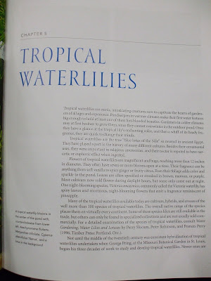
Besides the fact that aquatic plants are of interest to me, the waterlily is, to me, a phenomenal green. There are tropical waterlilies and hardy waterlilies. Of over a hundred species of cultivators, hybrids and crosses, what is interesting to me is how the waterlily grows from the bottom of the pool, and its leaves are fully open when they reach the surface of the water. It's stems continue growing but it gets all tangled and they spread themselves almost radially from the center. The simplicity of its appearance on water is kind of serene. I think having a print inspired by this plant is going to be lovely, but I have to be careful it doesn't turn out looking like costume.
There are lots of beautiful blooms of waterlilies but I am have chosen the Victoria
Amazonica, because it has a more pronounced texture on its leaves which I am currently working on. I did not see the
VA's flower during my three visits so I am not attacking its flower. I visited the
BG's library, and found two books on
waterlilies to get a better
understanding of these
Nymphaeacae family of water lilies- The Water Garden published by Thames and Hudson and Water Garden Plants by Greg Speichert.
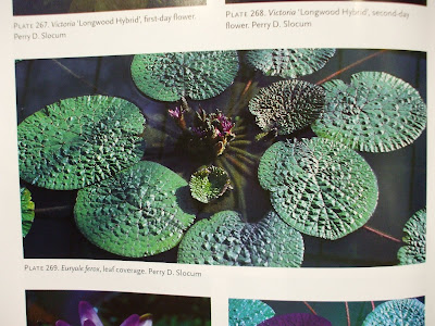
Crocodile skin-like textures
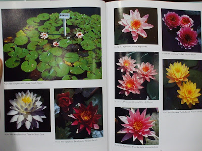
Some of the many varieties of blooms found across the world

Scientific drawings of plant structure
bit of history.
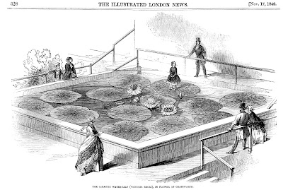
image via
wikipedia"On unbent leaf in fairy guise,
Reflected in the water,
Beloved, admired by hearts and eyes,
Stands Annie, Paxton's daughter..."
This plant, once named Victoria regia was the subject of rivalry between Victorian gardeners in England. The plant was presented by the Duke of Devonshire to Queen Victoria and named it in her honour.


