This is the chosen image I picked from the many pictures taken at Little India. It is a wooden horse puppet. I thought it was a good way to start my works based on horses, as these creatures are dominant animals throughout the history of man and also has an attractive value for children, as I intend to focus on kids wear.
This was the first drawing I did right after our field trip. I tried drawing the horse in proportion and varied the thick and thin lines with ink in light to dark shades.
The immediate critique received from the class after this drawing session was that I had drawn the horse well, and that I should try different colours and add more texture to the drawing.

I went home, and was unsure of how I should develop the horse. I tried tracing the horse above, in black calligraphy ink because it is one of my favourite medium, on baking paper.
I tried adding some colours after I had traced it out, by dripping and blowing silk paints across the drawings. It messed with the wet black ink, and I thought it was ruined so I put it way immediately.
Tang said, the drawing has "kinda lost" in the center.. I wasn't sure what it meant, but i know she doesn't like it either.


While I did this <- drawing, I was thinking about skeletons and skulls in the desert, the breakdown of bones, and therefore I used brown and orange paint to represent the dry, tribal aesthetic of the Mongolian deserts, cave art or something.
Emma and Tang said they liked this, but I wasn't so sure I liked it myself. It's a bit too 'tribal' for me?

I did this random sketch of a horse within a minute on a scalloped piece of paper. It was pretty amusing when I was done with it. On one hand, it looks like a really good piece of work for children's clothing, but on the other hand, I disliked it because I felt like it reminded me of Geoffrey the giraffe of Toys 'R' Us. I don't like combining yellow and black because I feel like there is a kind of message the colour combinations brings about to people, whether they are aware or not, to stay away from anything black and yellow because it represents danger, like a wasp.
Tang said this was a good picture I did, because the scalloped edges add character to the horse and that I would never be able to replicate it again since it was my state of mind that allowed to to come up with this. I AGREE!!! I still think it sucks. I want to try to make a horse print that is acceptable to both boys' and girls' clothing, and this is definitely not going to make it on a girl's tee shirt since the horse has a very strong boyish character to it.


I combined the elements of the wooden puppet with the skeletal lines of this picture I found, to create a sort of creepy horse? My idea was to have a sinister piece of art work that would appeal to both older boys and girls who like strange cartoons, in the likes of Edward Gorey or Tim Burton. I was also thinking of how to make this horse more surrealistic..

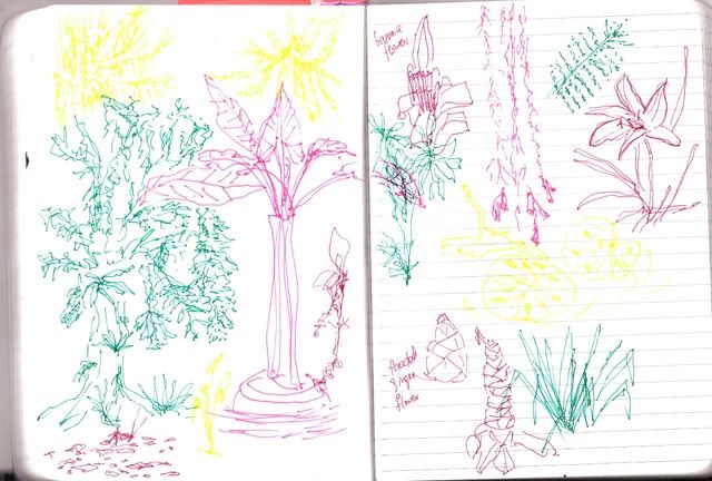
 I did some random paintings, line drawings. I tried very hard thinking about how I could change the plants in my drawing to make them look different and more contemporary.